
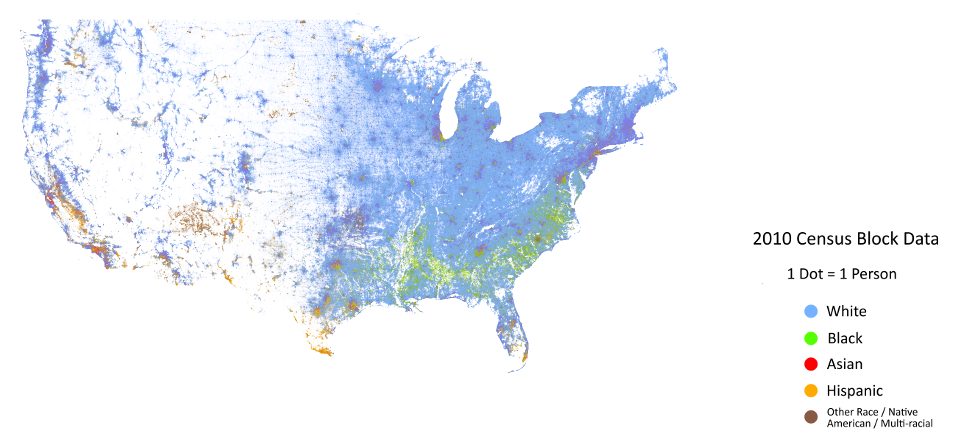
 As I have been researching the Black Belt (see this post) came across this wonderful visualization out of the University of Virginia. The map shows the Black Belt running across the South beautifully.
This map is an American snapshot; it provides an accessible visualization of geographic distribution, population density, and racial diversity of the American people in every neighborhood in the entire country. The map displays 308,745,538 dots, one for each person residing in the United States at the location they were counted during the 2010 Census. Each dot is color-coded by the individual’s race and ethnicity. The map is presented in both black and white and full color versions. In the color version, each dot is color-coded by race.
All of the data displayed on the map are from the U.S. Census Bureau’s 2010 Summary File 1 dataset made publicly available through the National Historical Geographic Information System. The data is based on the “census block,” the smallest area of geography for which data is collected (roughly equivalent to a city block in an urban area).
The map was created by Dustin Cable, a former demographic researcher at the University of Virginia’s Weldon Cooper Center for Public Service. Brandon Martin-Anderson from the MIT Media Lab and Eric Fischer, creator of social media dot maps, deserve credit for the original inspiration for the project. This map builds on his work by adding the Census Bureau’s racial data, and by correcting for mapping errors.
via The Racial Dot Map: One Dot Per Person | Weldon Cooper Center for Public Service.